
As the lead product designer for a brand new assessment reporting platform, one of my main goals was to systematically show the link between assessment and curriculum. A conventional assessment report shows what is on a test, but doesn’t connect it to the bigger picture of what students need to learn. To supply this context, we created a learning map: a spatial representation of a set of learning objectives, such as the Common Core State Standards in mathematics.

Each objective is represented by a hexagon, and the map shows all the objectives for one or more grade levels. The layout reflects learning progressions, with related objectives grouped together, building from predecessor skills to successor skills as you move from lower-left to upper-right.
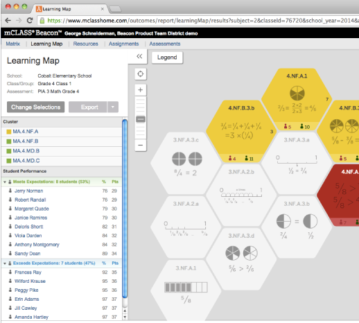
On a class learning map, if the assessment being reported upon covered a particular objective, it will be color-coded according to the percentage of students who performed well on it. Objectives that weren’t on the test are still displayed, but appear in white. The map is interactive, so you can click on an objective to learn more, zoom in to see more detail, zoom out to see the big picture, or pan to focus on a different area.
When you zoom in, the Learning Map displays a variety of metadata and data for each standard. 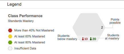 The identifier (e.g. “3.NF.A.1”) is supplemented by an icon representing the content of the standard. Additional data points are shown, as represented by the legend at right. If you were to zoom in yet further, the hexagon would also include a short text summary of what the standard requires.
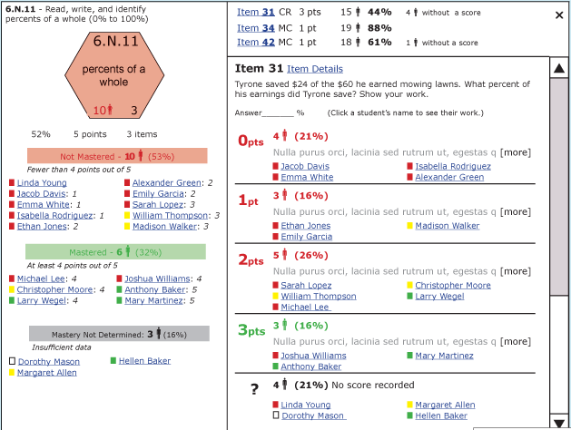
Another key type of interactivity is drilling down on a learning objective, which displays an overlay with rich detail about that objective: Which students struggled with it? What types of questions were used to assess it? How well did those questions get at the underlying objective, and how did different students do on different questions? For multiple choice questions, the overlay also shows which students chose each “distractor” (incorrect answer choice), along with a short explanation of a procedural error, conceptual misunderstanding, or other confusion that might have let to that incorrect choice. For short answer and essay items, the overlay provides access to the student’s actual response (either a scanned image of a paper answer sheet, or an a response entered with the keyboard).
Most of the images shown on this page are screen shots from the finished web application, or visual design mockups, on which I collaborated closely with the technical lead, front-end engineer, and visual designer. By contrast, the last two images are examples of wireframes that I produced myself. These were used both for iterative ideation and gathering feedback, and as inputs into the visual design process. In addition to creating wireframes, I also authored the learning map functional specification, which included working out all of the business logic associated with the calculation of performance bands under various scenarios, such as how to handle students with unscored answers, as well as the selection of more than one assessment at a time. I am the co-holder (along with two of the company’s top executives) of two patents that were issued for the interactive learning map.
![]()