Beacon
Beacon is a built-for-the-web assessment platform with a fundamental orientation towards helping teachers to understand and act upon data from tests written to the Common Core Learning Standards. I was a member of the Beacon team for several years, and have showcased various aspects of my work on this product.
Beacon offers two main ways to view assessment results:
![]() The Learning Map is an interactive spatial visualization of a set of related learning objectives, designed to place assessment data into its larger instructional context.
The Learning Map is an interactive spatial visualization of a set of related learning objectives, designed to place assessment data into its larger instructional context.
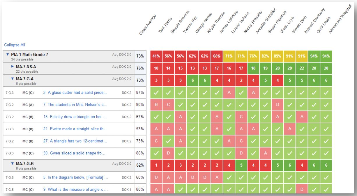 The Matrix Reports are a collection of tabular reports that organize assessment data in a variety of ways to help teachers find the most important factors shaping student performance on assessments.
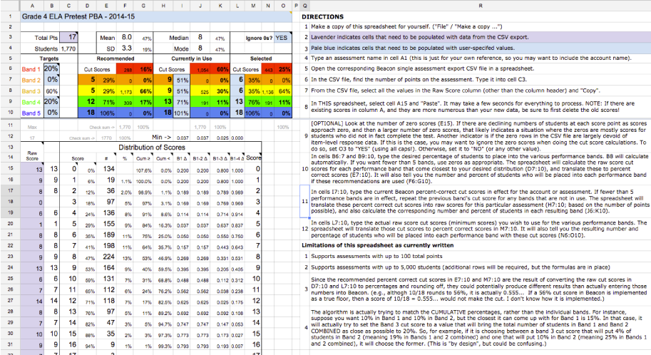 In addition to working on Beacon in a traditional product design capacity, I also conceived, designed, and built several spreadsheet-based tools to help our customers (school districts) choose appropriate cut scores to use with their Beacon-based assessments.
Finally, I have included included two examples of usability-related work I did on Beacon:
- a usability test script that I wrote to conduct usability testing with paper proptotypes
- a specification to change the business logic underlying the default parameter selections the Matrix and Learning Map reports, to better anticipate what data a teacher was likely to want to see
Data Visualization Work in D3.js
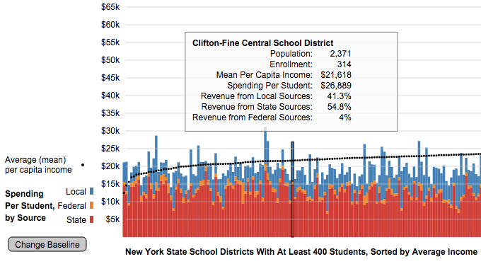
This is a visualization of school funding data for districts across New York State. It shows per-student spending, and breaks it down according to the district’s revenue sources, local, state, and federal. Average income data is overlaid on the same chart, and clicking on any bar will bring up the district name and other pertinent information. The baseline is also user-selectable, making it easy to compare by any of the three funding sources. I did this using data from the Census, and included every district in the state with at least 400 enrolled students.
An E-Reader for Schools
 These are conceptual wireframes for a product idea that I developed and pitched at Amplify, but which was not built. Specifically, I was asking the question, what unique features might differentiate an e-reader designed specifically for use in secondary schools?
SLI/InBloom
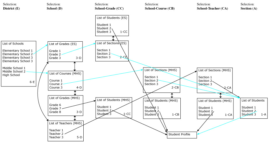 SLI was a major foundation-funded initiative to built an infrastructure that states and school districts could use to securely share student data with technology vendors. Wireless Generation was the prime contractor. Most of my work on SLI was data modeling and business analysis and doesn’t lend itself well to inclusion in a portfolio, but I did do some site map / user flow work for which I have included some deliverables here.
ARIS
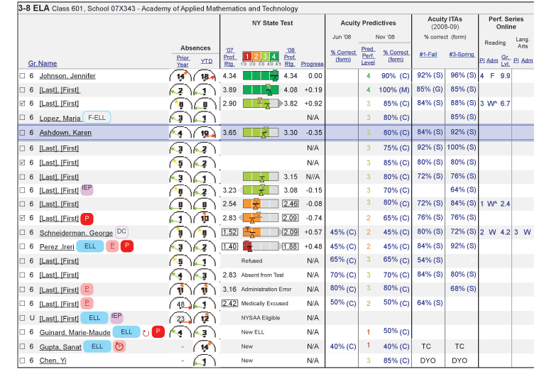 ARIS was a data dashboard and teacher collaboration system built by Wireless Generation for the NYC Department of Education. I was the lead designer for all of the data dashboards.
A “Bayesish” Perspective on Multiple Choice Score Data
This is a data analysis project that I did for a “hack-a-thon”, in which I developed a methodology that could be used to help account for the impact of random guessing when using data from multiple choice test questions to make determinations about what students are likely to need additional support in what skills.
Interaction Design for Account Security
Practically every web app has to deal with account security issues, such as a mechanism for users to recover access in the event of a lost password. These issues tend to be approached almost exclusively from a technical perspective, with little attention paid to user experience. I worked on defining best practices in account security from a user interaction perspective, and have showcased some excerpts from that work here. This is a rather dry thing to put into a portfolio, but I think it demonstrates both the broad way in which I conceive of the scope of UX, and the importance for user experience of things that are perhaps more often thought of as business analysis.
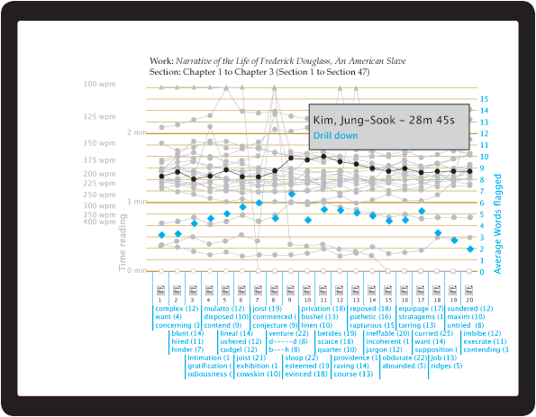
TRC Reading Level Graph
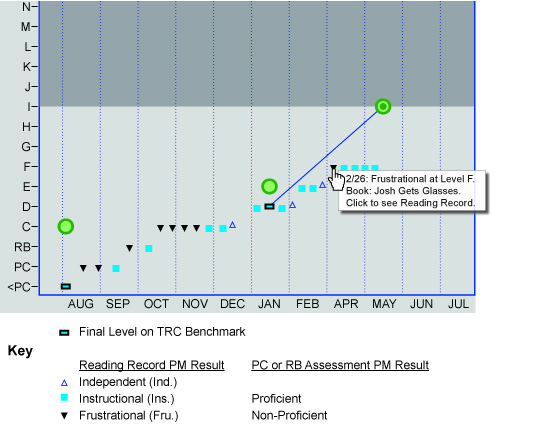 This is a web report that I designed for TRC, a “leveled reading” assessment. A challenging aspect of these sorts of assessments is that the results are often open-ended, indicating only a floor or a ceiling on a student’s actual reading level. Showcased here is the graph that I designed to display that uncertainty.