While the Beacon Learning Map offered an exciting and innovative way to interact with data, there are important analysis use cases that it cannot address; this is where Matrix Reports came in. In particular:
- The Learning Map presents data aggregated at the class level, or one student at a time. The Matrix enables a user to look at data for many individual students at the same time.
- The Learning Map is standards-centric, and thus can only show assessment data broken down by standard. The Matrix enables other views of the data, such as by passage, level of cognitive rigor, and cluster.
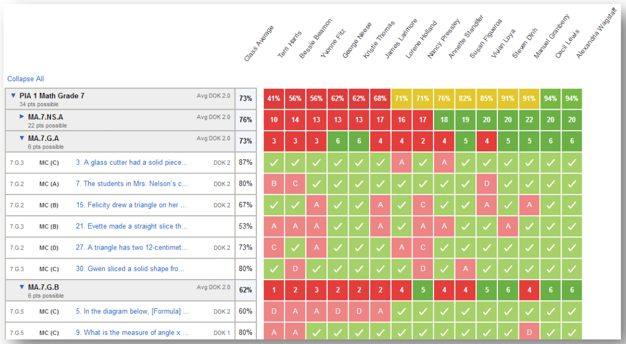
 Each column displays data for a single student, and each of the “lowest level” rows represents a single question. Originally, the Matrix report, like the Learning map, was standards-centric, with roll-up rows representing standards. But sometimes, the most interesting patterns may relate to other facets of a test, such as the depth of knowledge that different questions require. This is especially true for reading comprehension tests, where different passages may pose different challenges that might be related to text complexity, the type of material (e.g. non-fiction, fiction, or poetry), or the subject matter. So later, we used the inherent flexibility of this structure to facilitate many other ways of looking at the data, treating the original Matrix report as a template and creating an entire family of different Matrix reports.
In the screen shot above, aggregation is at the “cluster” level. (In Common Core Math, “clusters” are small collections of related standard. For instance, 7.G.A encompasses the first 3 standards in the Grade 7 geometry domain.) The clusters can be collapsed to facilitate cluster-to-cluster comparisons, or expanded to show the individual questions. We also added the ability for the teacher to select more than one test at the same time, either to combine them together (for instance, to have more questions per cluster), or to compare them (for instance, to compare performance by cluster before and after a unit of study).
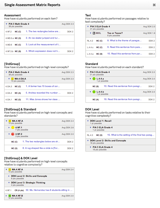
As the number of Matrix report permutations grew, it started to become difficult to keep track of them, and the original selection mechanism become somewhat unwieldy. For instance, the distinction between an “Assessment and Standard” report and a “Standard and Assessment” report can be confusing. I took a multi-pronged approach to remediating this complexity.

First, I incorporated a link to a printable “cheat sheet” into the interface. This gave teachers a handy reference that helped them to choose the right report, and also helped to “advertise” the range of new reports that had been incorporated into the product. Critically, it also associated each report with a question that that report was designed to help answer.
Second, I recognized that a good deal of the complexity was a result of reports that really only added value when multiple tests had been selected. By not even offering up those reports with a single test selection (which was the most common use case), we were able to cut out much of the complexity altogether.
Finally, I added three headings or top-level classifications to the relevant dropdown menu. Although this had the effect of making the menu longer than it had been before, it also reduced the associated cognitive load. Instead of being confronted with just a list of nine reports to choose from, there were three categories, each of which had no more than three associated reports.
I did the UX design and wrote the functional specification for the original Beacon Matrix report, and was subsequently transferred to a new division within the company for a special project. After that project wrapped up, I returned to the Beacon team in a product management capacity, where I oversaw and managed the addition of new Matrix reports that aggregated data based on new and different dimensions, as well as as reworking Matrix reports to accommodate new types of questions beyond multiple choice and constructed response.